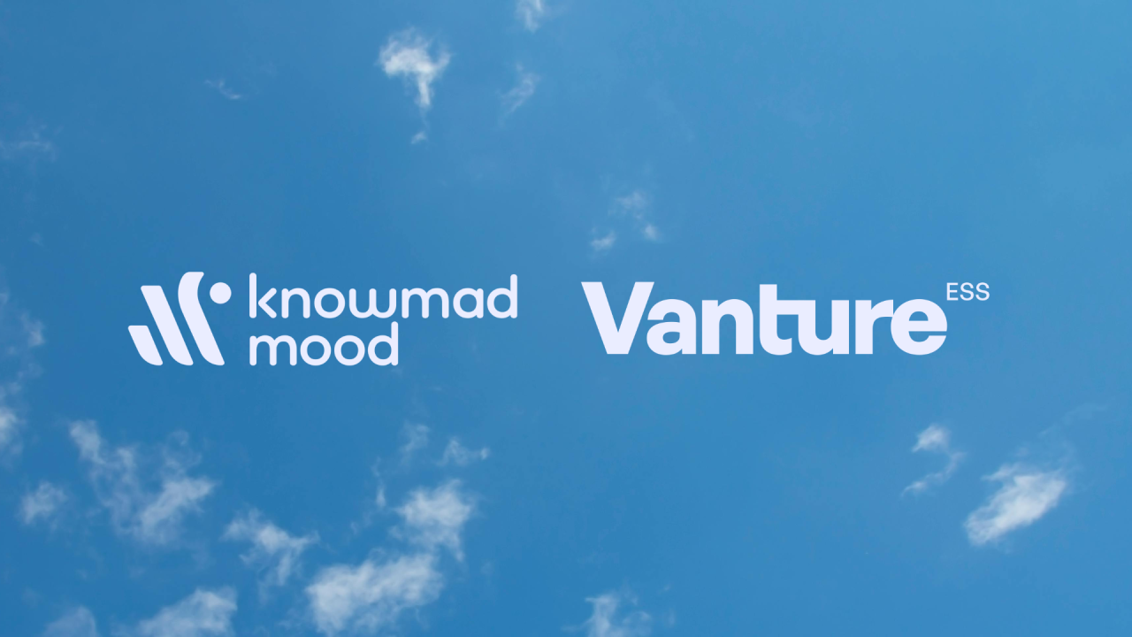
Today starts a new chapter in Vanture ESS

We are launching a new logo, a new graphic universe and a new website, which are in line with the brand’s previous values, but at the same time bring it up to date with current trends.
We are very happy to present the result of months of work, reflection and commitment: a new image and a completely renewed website!
Why a makeover?
For us, growth is more than just a visual update. This change represents who we are today and where we are going. We are renewing ourselves because we believe in adapting to the needs of our customers and in transmitting, from the first glance, our values of quality, innovation and proximity.
What this evolution means
More than just a new logo and design, we have taken this opportunity to improve our users’ experience. The new website is streamlined, intuitive and designed to make finding everything you need quick and easy. And every visual element of our new identity has a story: it symbolizes our vision for the future, our commitment and our passion for what we do.
Why we rebranded
The current logo posed several challenges: its legibility and interpretation were limited, and the serif typographic style projected an image far removed from the technology sector. In addition, the color palette did not help communicate either the essence of the brand or its relationship with the industry.
As a company, we have decided to take on the challenge of starting a new stage, motivated both by the consolidation of our strategic positioning and by the desire to achieve new business objectives.
What are we looking for with rebranding?
1️. A logo that is easy to read, visually appealing and reflects the company’s values.
2️. Incorporate a technical descriptor to help communicate our mission and the services we offer.
3. An identity capable of capitalizing on the achievements of the past, while marking a new path in communication and perception.
The process
During the process, we thoroughly analyzed the essence of the brand to identify the elements that should be maintained and those that needed to be updated. We reviewed the composition, typography and colors of the current identity, seeking to simplify it in order to improve its memorability and legibility.
The proposal
Our new identity stands out for:
A more compact and stable design that reflects closeness and professionalism.
A renewed color palette, with greater intensity, to capture the attention of the sector and reinforce our technological personality.
A dynamic visual language that communicates our ability to adapt and personalize each project.
This rebranding not only responds to the need to modernize our image, but also reflects our vision for the future, our values and the confidence we want to convey to our customers.